This guide explains how to use Omeka.net. From Chapter 3 onward, the instructions also apply to Omeka Classic.
Creative Commons - BY -- 2014
Use Case: Scholars, Omeka.net, http://info.omeka.net/omeka-net-help/use-case-scholars/
(Translated and revised by: Satoru Nakamura)
This plugin is available on all plans.
The Exhibit Builder plugin allows you to create online exhibits and special web pages that combine Omeka items. You can also include descriptive text.
Exhibits consist of pages, generally starting with an introductory page for the exhibit, followed by pages that associate items from the Omeka database. Exhibit Builder exhibits can be as short as a single page or span multiple pages. Exhibit pages can also be organized hierarchically.
The layout of Exhibit Builder exhibits is highly customizable, with pages composed of smaller units called blocks. Exhibit Builder has three content block types: text, gallery, and text block.
Configuration
Select "Plugins" from the admin top navigation. If you have not yet activated Exhibit Builder, you need to do so before configuring it. Select "Configure" to choose the order in which exhibits are displayed. Exhibits can be sorted by date added, alphabetical name, or most recent.
-
From the dropdown menu, select the order for the "Browse Page Exhibit" display.
-
Remember to save your changes.
Getting Started
Once you have activated and configured the Exhibit Builder plugin, "Exhibits" will appear in the left navigation bar. Click it to go to the exhibits browse page (admin/exhibits).
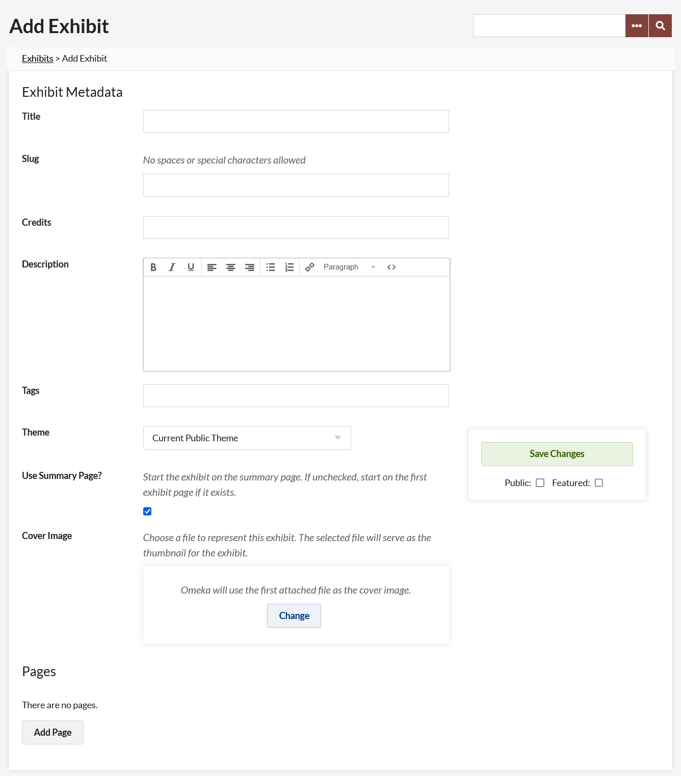
To create an exhibit, go to the "Exhibits" tab and click the green "Add an Exhibit" button. This will open a new page where you can enter the following metadata:
-
Title: The name of your exhibit. This is displayed to users.
-
Slug: An abbreviated exhibit name that appears in the URL. For example, http://yoursite.omeka.net/exhibits/show/slug.
-
Credits: Acknowledgements that are displayed publicly.
-
Description: An introduction or overview of the exhibition.
-
Tags: Keywords or themes that provide users with another way to find exhibits.
After entering the data, click "Save Changes" to create the exhibit.
Themes
By default, exhibits are displayed using the same theme as the rest of the site. Alternatively, you can select a different theme for each exhibit. To do this, select a theme from the dropdown, which defaults to "Current Public Theme".

After selecting a specific theme for an exhibit, you can configure that theme by adding a logo, header image, footer text, and copyright information that will only appear in that exhibit. If you change themes, you need to click "Save Changes" before configuring the theme. For example, if you were using the "Berlin" theme and want to switch to the winter version of the "Seasons" theme, you need to click "Save Changes" after switching from "Berlin" to "Seasons" in the theme dropdown list before configuring the "Seasons" theme.
Pages
After creating an exhibit, you can add pages by clicking the "Add Page" button at the bottom of the exhibit metadata page.
On the "Add Page" screen, add the following:
- Page Title: Displayed to users and used for navigating the exhibit.
- Page Slug: An abbreviated exhibit name that appears in the URL. For example, http://youromekasite/exhibit/show/exhibit_slug/page_slug
To save the page information and continue editing that page, click the "Save Changes" button. To save the basic information for that page and add another page, click the "Save and Add Another Page" button.
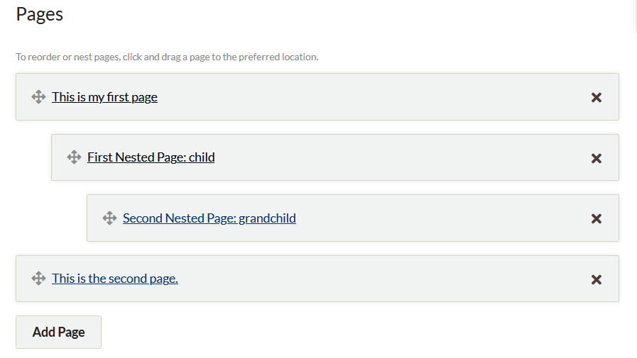
Organizing Pages
Omeka.net exhibits can have multiple pages. These pages can be reordered by drag and drop. You can also use drag and drop to set up a hierarchy for exhibit pages. Note that these hierarchies cannot be more than 3 levels deep.
You can also delete pages from the exhibit metadata page in two steps. First, click the black X on the display bar of the page you want to delete. After clicking the X, the bar will turn red (see the Edward page bar in the image below). Clicking the arrow will undo the delete action. To confirm the page deletion, you need to click the "Save Changes" button. Deleted pages cannot be recovered.
Content
Exhibit Builder pages are created by combining smaller content units called "blocks." There are four types of blocks: File with Text, Item Gallery, Text Only, and File Only. Each page can have one or more content blocks.
The File with Text block allows you to pair full-size or thumbnail item files with a block of text. All item files will be the same size. Text appears either to the right or left of the items. You can use a single item file paired with text, or have multiple item files to the right or left of the text block.
The Gallery block creates a gallery of item files, typically large square thumbnails. If you add text to the gallery, it appears to the left or right of the gallery. Gallery blocks allow you to specify a showcase file that is displayed at full size to the right or left of the text. Other gallery images can be placed below the showcase image or next to the text above the text. Exhibit Builder uses the first item in the block as the showcase. Note that you can reorder items by drag and drop. If there is no showcase file or text, the gallery uses the full width of the page.
The Text block allows you to create a section of text that spans the full width of the page.
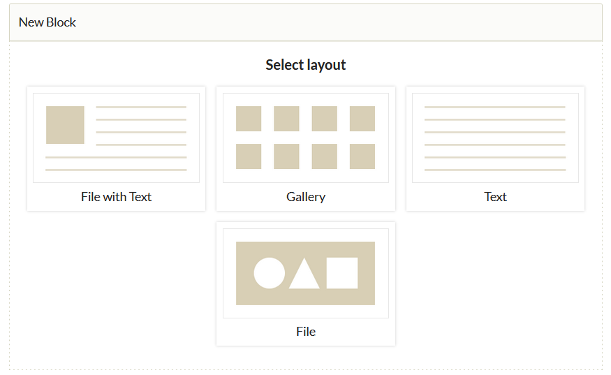
To add a content block, select the desired layout in the "New Block" dialog box. After selecting the type you need, click the "Add new content block" button. A new block will appear on the page for you to compose your content.
Adding Items
If you selected a block other than text-only, click the large plus sign button that appears in the item area to select items. The "Items Browse" dialog box will appear, showing all items. You can search or browse for items. To select an item, click its bar. A dark brown "Select Item" button will be highlighted at the right end of the bar. Clicking "Select Item" will display options for creating a caption for that item. If multiple files have been uploaded to a single item, you can click a file to choose which one to use. When finished, click the green "Apply" button in the lower right corner to add the item.
After adding items, you can change the caption or selected file by clicking the edit button at the bottom of the item icon. To remove an item, click the x in the upper right corner of the item icon. The icon will be grayed out, indicating it will be deleted the next time you save changes. If you decide not to remove the item, you can click the arrow that replaced the x, but you must do so before saving changes.
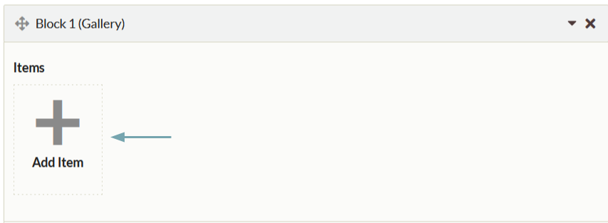
Exhibit text can be formatted using the formatting toolbar at the top of the text input box or HTML. To write your own HTML or paste from another source, click the blue HTML button on the formatting toolbar at the top of the text input box. This will open the HTML Source Editor window.
Layout Options
Both File with Text and Gallery blocks include layout options for changing the appearance of the exhibit page. To access these options, click the black triangle button to the right of the layout options text at the bottom of the block. A dropdown menu with options to change the layout will appear.
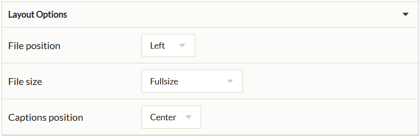
File with Text allows you to change the file position and file size. The file position can be either right or left. The file size can be selected from full-size, thumbnail, or square thumbnail. Your selection affects all files in that block. Text in this block is fixed to the right or left of the file, but wraps below when the text length exceeds the file height.
Gallery allows you to change the gallery position and select the position of the Showcase file. The Showcase file is displayed at full size, while the remaining gallery files are large square thumbnails. Exhibit Builder uses the first item in the block as the showcase. Note that you can reorder items by drag and drop. If there is no Showcase file or text, the gallery uses the full width of the page.