TL;DR
RAWGraphs is an open-source, browser-based data visualization tool. Simply drag and drop a CSV/TSV file to create over 30 types of charts, then export them as SVG or PNG. No programming required — making it an ideal entry point for data analysis in Digital Humanities (DH) research.
What is RAWGraphs?
RAWGraphs is an open-source project developed by the DensityDesign Lab at Politecnico di Milano, Italy. It is released under the Apache 2.0 license and is free for anyone to use.
Key features include:
- Fully browser-based: No installation needed — just open a web browser and start
- Data privacy: All data is processed client-side and never sent to a server
- 30+ chart types: Beyond standard bar charts and scatter plots, it supports advanced visualizations like Alluvial Diagrams, Bumpcharts, and Sunbursts
- D3.js-powered: Built on D3.js, producing high-quality SVG output
How to Use RAWGraphs
The workflow consists of four simple steps.
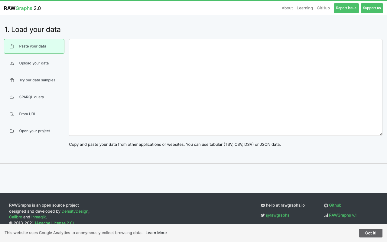
1. Load Your Data
Visit the RAWGraphs app and drag and drop a CSV/TSV file, or paste data directly into the text area. It also supports Google Sheets imports and JSON data. Sample datasets are available for first-time users to experiment with.
2. Choose a Chart Type
Select a chart type that suits your data. Charts are organized by category: Hierarchy, Time Series, Distributions, Correlations, Networks, and more.
3. Configure Mapping
Drag and drop data columns onto visual elements (X-axis, Y-axis, color, size, etc.). This intuitive mapping interface is RAWGraphs' greatest strength.
4. Export
Download the finished visualization as SVG, PNG, or JSON. SVG files can be further edited in tools like Adobe Illustrator or Inkscape.
Practical Applications in DH Research
Bibliographic Data Visualization
Using CSV data from library OPACs or bibliographic databases, you can visualize publication counts by field across time periods using Streamgraphs or Stacked Area Charts. This is effective for grasping academic trends at a glance.
Historical Network Visualization
From correspondence data (sender and recipient), Alluvial Diagrams can reveal the structure of intellectual networks. For example, analyzing epistolary networks among Edo-period Confucian scholars.
Text Analysis Results Display
Export the results of morphological analysis or topic modeling as CSV, then visualize them in RAWGraphs as Treemaps or Circle Packing diagrams to intuitively understand the lexical structure of a text corpus.
Cultural Heritage Data Analysis
Visualize museum or gallery collection metadata (era, region, material, technique) across multiple dimensions to analyze collection characteristics. Parallel Coordinates allow simultaneous comparison of multiple attributes.
Comparison with Other Tools
| Feature | RAWGraphs | Tableau Public | Google Charts |
|---|---|---|---|
| Cost | Free (OSS) | Free (limited) | Free |
| Installation | None | Desktop app | None (API) |
| Programming | None | None | JavaScript |
| Chart types | 30+ | Very many | 30+ |
| Data privacy | Client-side | Cloud | Cloud |
| Customization | SVG editable | High | Code-based |
RAWGraphs is best suited for researchers who want to visualize data quickly without writing code. For more advanced interactive visualizations, consider Tableau Public or using D3.js directly.
Conclusion
RAWGraphs is an ideal tool for DH researchers taking their first steps in data visualization. It creates high-quality visualizations without code, and since data never leaves the browser, privacy is assured. Whether for conference presentations or journal figures, it is worth trying.